Spenby Group: Brand Identity & Visual System
The Design Challenge
Spenby Group, a collective of companies driven by a mission to prioritise people, foster growth through trust, and give back to the communities they serve, required a new brand identity. The core challenge was to create a visual language that was empathetic and trustworthy. It needed to not only look professional but also authentically reflect Spenby’s deep commitment to its values, simplifying complexity so its businesses and communities could thrive.
The Foundation: Core Brand Attributes & Voice
Our strategic process began with a deep dive into the brand's core values, resulting in a list of key attributes that served as the foundation for all design decisions. We then crafted a series of taglines that translated these attributes into a compelling brand voice.
Core Attributes:
-
Human-centred personality: Fun, easy to work with, enthusiastic, upbeat, energetic, one of the team.
-
Trust & professionalism: Dedication, trusted partnership, longevity, commitment, transparency, assurance.
-
Adaptability & impact: Agility, adaptability, supported, relieved, reassured, satisfied.
Brand Voice:
-
"Understanding that individuals power businesses, we become part of your team."
-
"Giving our customers the confidence to achieve their goals."
-
"Dedicated to making your success our priority."
Spenby Group Brand Guidelines


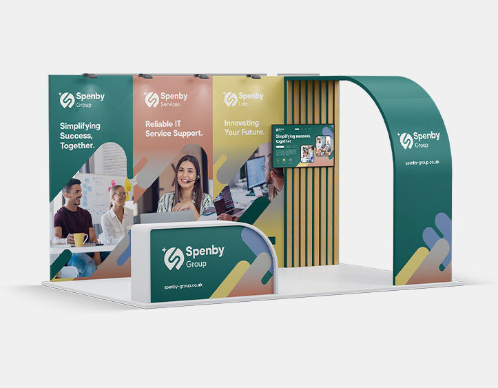
The Visual Solution: The Final Identity
Every element of the Spenby Group identity was designed to visually represent these core attributes. As the Senior Graphic Designer, I developed the complete brand identity, from initial concepts to the final guidelines.
-
Logo & Mark: The final logo subtly integrates a human element within a protective form, symbolising the trusted, collaborative partnerships Spenby builds. A hidden 'S' reinforces the brand’s identity with a sophisticated touch.
-
Visual System: A dynamic, fluid line was created as a core graphic element, weaving through all brand materials. This element visually connects each part of the business, representing continuous innovation and support while ensuring a consistent brand presence.
-
Colour & Typography: A grounded and purposeful colour palette was chosen, blending natural tones with intentional accents to reflect trust and sustainable growth. For typography, we paired a custom, striking font for headlines with a clean, highly readable typeface for body copy, balancing modern sophistication with digital accessibility.
Creative Process: From Strategy to Solution
With the brand strategy and verbal identity established, the creative process began. The core focus was to create a visual identity deeply rooted in human connection and trust, portraying innovation and growth through a lens of people and community. The motto “keep it simple, have fun, get things done” guided the design, ensuring the identity was approachable and not overly corporate.
I began by sketching abstract shapes associated with the brand’s keywords, then combined these to represent the core values. This led to six initial logo options in line vector shapes. After discussing the pros and cons of each with the group, I refined the concepts to a final two or three before developing the chosen solution further.


Logo Options


Final Logo
Colour Palette
Our grounded and purposeful Spenby Group palette blends natural tones with intentional accents, reflecting trust, community, sustainable growth, and a human touch. Primaries like Deep Forest Green and Warm Stone Grey convey stability; Ember Clay, Soft Gold, and Dusky Blue add warmth, connection, and subtle innovation. Tints should be employed for backgrounds, subtle overlays, and graphical elements where a softer presence of the brand colour is required.

Fonts
Our typography balances modern sophistication with digital accessibility. Spenby, our custom font, is reserved for our logos and headlines, creating a strong and recognisable brand presence. For all body copy, we use our custom font Spenby UI, a clean and highly readable typeface specifically designed for optimal clarity on digital screens.


Graphic Elements
Our brand’s visual identity uses a family of graphic elements, starting with the dynamic, fluid shape taken from our logo. This is complemented by subtle intersecting and overlapping forms that symbolise collaboration, gradient blends that add depth and progression, and delicate texture overlays for a warm, tactile feel. Together, these create a cohesive and engaging visual language for Spenby Group.


Photography
Our photography style is authentic, warm, and people-focused, prioritising natural lighting and genuine moments. Images should highlight human connection and positive impact, feeling approachable and real to reflect the communities we serve and the trusted relationships we build.


Brand Visuals
Our brand’s visual identity uses a family of graphic elements, starting with the dynamic, fluid shape taken from our logo.
This is complemented by subtle intersecting and overlapping forms that symbolise collaboration, gradient blends that add depth and progression, and delicate texture overlays for a warm, tactile feel. Together, these create a cohesive and engaging visual language for Spenby Group.